How to Italicize in LaTeX: \Textit vs \Emph Explained
Learn how to italicize in LaTeX with \textit, \emph and \itshape, plus nested emphasis, italic correction and math mode fixes, with compilable examples.
Use \textit{word} when you need italic type, and \emph{word} when you need emphasis. The comparison table below shows how those two differ from \itshape, \textsl, and \textup.
If italics were only a look, why does the same word snap back to upright the moment you nest it? Most beginner notes treat italicizing as a single syntax trick. A thesis template can already italicize a caption, a theorem, or a heading, and a command that only paints letters italic then disappears into the surrounding type. The durable choice is whether you are marking meaning or forcing a font shape.
Table of Contents
- Which LaTeX Command Italicizes Text
- How to Italicize Text Step by Step
- Choosing Emphasis or Italic by Context
- Fixing Nested, Spacing and Math Italics
- Final Italic Check Before Submission
Which LaTeX Command Italicizes Text
\textit{word} gives an italic font shape. \emph{word} marks emphasis, and in ordinary upright text it generally produces italics. The LaTeX font guide treats \textit{...} as the argument-based command and \itshape as the matching declaration. LaTeX itself was first released by Leslie Lamport around 1984, and these commands have been standard tools in structured academic documents since that system took hold.
| Command | What it does | Use it when | Inside upright text | Inside italic text |
|---|---|---|---|---|
\textit{...} |
Argument-scoped italic font shape | A style guide requires italic type | Italic | Italic, no contrast |
\itshape |
Declaration that changes shape until the group ends | A longer italic passage inside braces | Italic until the group closes | Italic |
\emph{...} |
Semantic emphasis | Marking a term or idea for emphasis | Italic | Upright |
\textsl{...} |
Slanted font shape | Slanted type, if the font provides it | Slanted | Slanted |
\textup{...} |
Upright font shape | Resetting to upright inside a larger italic block | Upright | Upright |
Argument commands stop at the closing brace. \textit{important} italicizes only “important” and leaves the next sentence alone. \itshape keeps the new shape from its point of use until the current group ends, so writers normally wrap it as {\itshape italic text}, or place it in an environment when a longer passage needs the same style.
\textsl is not a second spelling of italic. It selects a slanted, or oblique, shape only when the font provides one. Nested \textit stays italic on italic. Nested \emph switches back to upright so the emphasis still contrasts.
Practical rule: Use
\emphin prose. Use\textitonly when a style guide or template explicitly asks for italic type.
How to Italicize Text Step by Step
Decide first what the markup means: emphasize a term semantically, or force a word into italic type. That choice decides which command wraps the words.
The font guide workflow is short: identify only the words that need a typographic change, enclose them, compile, and inspect line breaks and punctuation. \textit works here because its scope ends at the closing brace, though \emph is the better choice for conceptual emphasis in prose. Either way the change cannot leak into later paragraphs, headings, captions, or references.
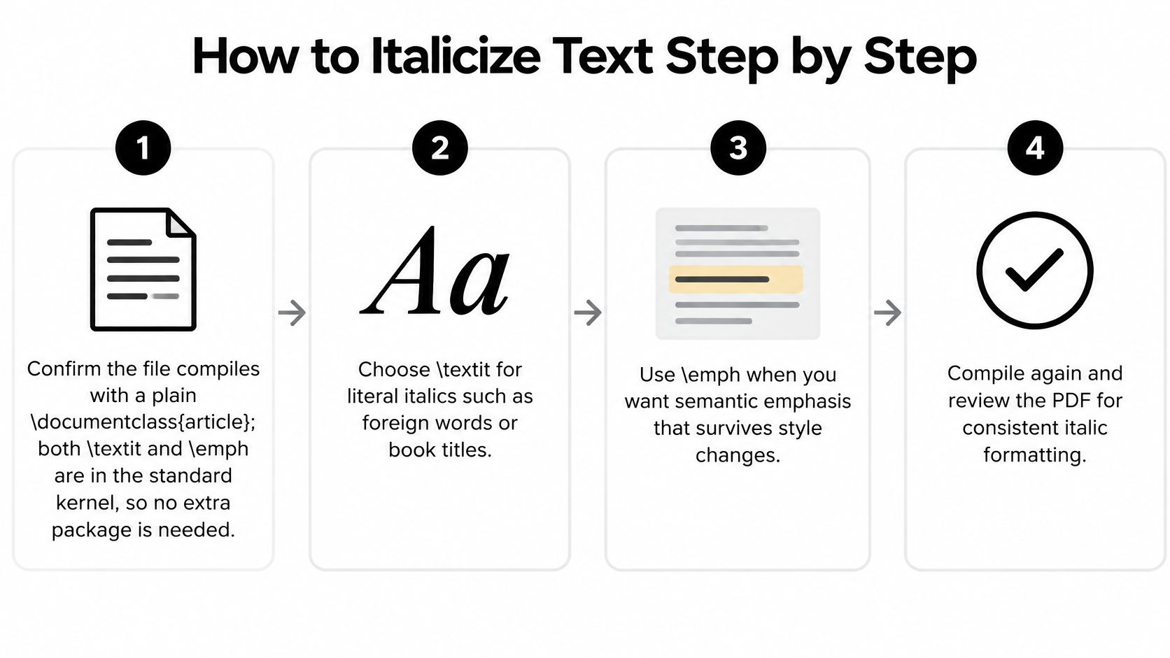
- Confirm the file compiles with a plain
\documentclass{article}. Both\textitand\emphlive in the standard kernel, so you don't load an extra package just to italicize a word. - Pick only the words that need italic type, usually a term or a short phrase such as
\textit{critical result}. Leave the rest of the sentence in the body font. - Keep the braces tight around those words. A space inside the braces, or a brace that closes one word late, is the usual reason a comma or the next clause picks up the shape.
- For a longer passage, use
{\itshape ...}so the change can't run into the next paragraph. When that italic text ends beside upright text, add\/before the closing brace. - Compile with
pdflatex, or with your editor's build button, and open the PDF. Source highlighting is not the same as the printed line. - Check line breaks, the punctuation after each italic word, and any heading or caption where the phrase repeats. If that phrase also sits on a dissertation title page, compare both places in the PDF.
What a correct result looks like
The marked word is italic. Nothing after the closing brace has changed shape. The sentence still reads as one line of prose, with no unexpected gap before a comma or period.
In most LaTeX editors, select the word and type the wrapper by hand. Use the editor's bracket matching to confirm the braces close around only the intended words before you compile. That one check stops the leak that a bare \itshape causes when it sits at the start of a paragraph.
The \/ in step 4 earns its keep here. Italic glyphs lean toward the characters that follow them, so without that small correction the last letter can sit against, or even touch, the upright letter or parenthesis next to it. Check the PDF at print size: the shape change should end cleanly at the closing brace, and the gap after the italic word should match the spacing elsewhere in the line.
Choosing Emphasis or Italic by Context
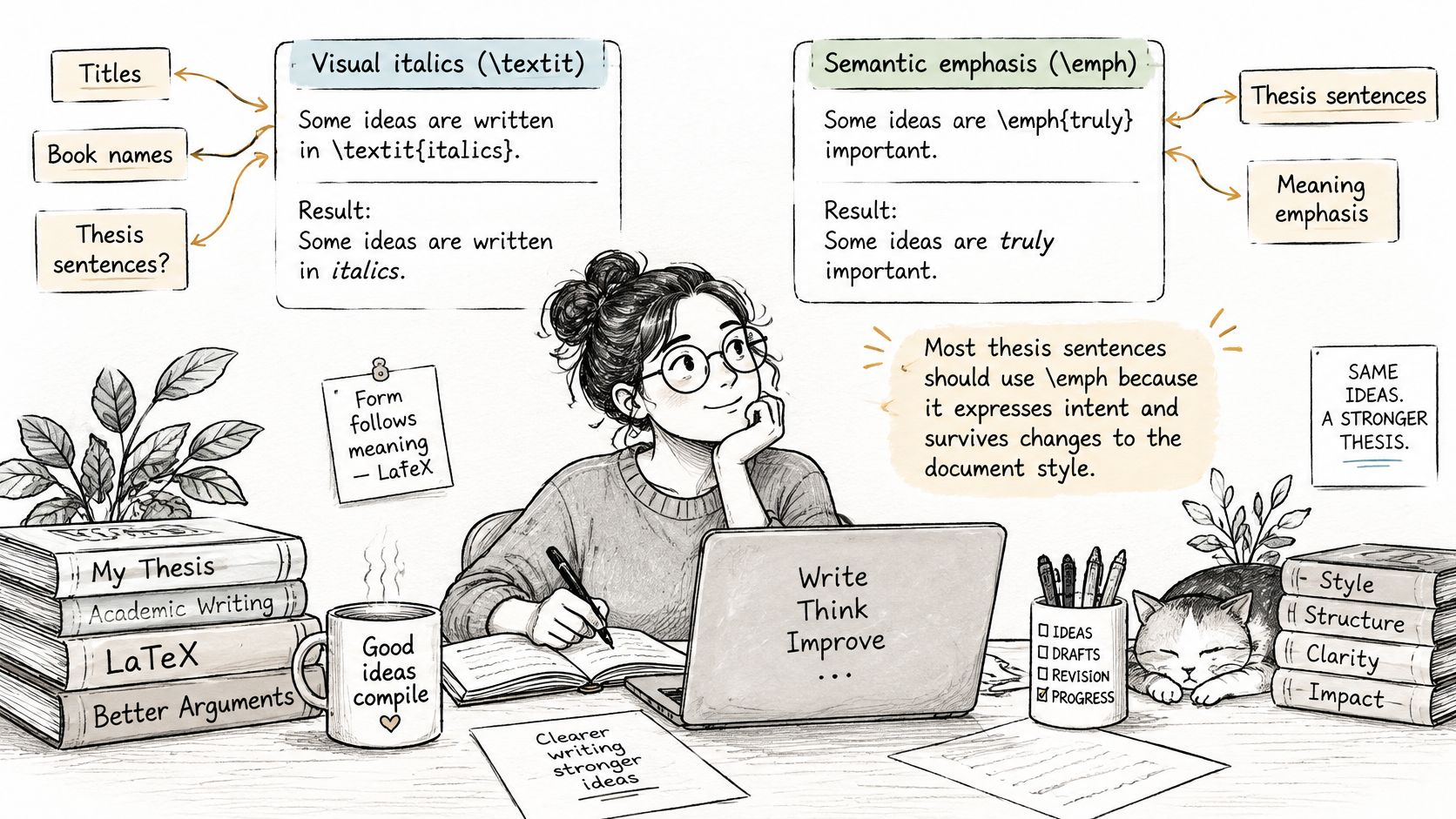
Most introductions present \textit{...} as the default. The Overleaf 30-minute LaTeX lesson is part of a wider set of beginner material that answers the syntax question and skips the editorial one: should you mark a term as emphasized, or force it to appear italic? \emph is often preferred for thesis writing because it expresses meaning rather than prescribing a font shape. Document classes can change how that emphasis appears.
| Context | Command or mode | Why |
|---|---|---|
| Conceptual emphasis in the thesis body | \emph{...} |
Expresses intent and keeps contrast when nested |
| Italic required by a style guide | \textit{...} |
Forces italic type regardless of surrounding text |
| Titles of books, journals or films | \textit{...} or the style guide format |
Follow the citation style your department requires |
| Scientific names and foreign words | \textit{...} in most style guides |
Convention, not emphasis |
| Theorem, caption or quotation in a class that italicizes | \emph{...} |
Lets the document class decide the style |
| Mathematical variables | Math mode, italic by default | Use \mathrm or \text for operators and words |
Where readers hesitate
Style-guide italics. A publisher that wants book and journal titles in italic is asking for a shape, not for emphasis. \textit is the right force there. An APA-style chapter title inside an edited volume is a citation decision first. Check a guide such as APA chapter in an edited book before you wrap the title by habit.
Names and foreign words. Homo sapiens and a phrase such as in situ are italic by convention in most style guides. That isn't conceptual stress. \textit records the convention. If you later emphasize one word inside that italic name, \emph is what restores contrast.
Places the class already italicizes. Theorem environments, captions, quotations, and some headings set the surrounding text in italic. An explicit \textit overrides the template and can produce italic on italic with no extra contrast. \emph lets the class decide the look, which is what you want when you change templates.
Mathematical letters are already italic in math mode. Don't wrap a variable in a text italic command. Check the class file or the journal guidelines before you lock a shape in, especially if you might switch from article to a university class later.
Fixing Nested, Spacing and Math Italics
Compile first, then read the PDF. The symptom in the output tells you which command is wrong. Judging the source alone misses cramped commas and italic that has already leaked.
Nested emphasis that vanishes
\emph{outer \emph{inner} outer} should print the inner phrase upright. The LaTeX2e reference treats that return to upright type as the check that semantic emphasis is behaving as intended. \textit inside a passage that is already italic stays italic, so nothing stands out. \textup{...} is the explicit return to upright when you must force the roman shape inside a larger italic block.
If the emphasized word is invisible in a theorem or an italic caption, the command is painting the same shape the environment already chose.
Italic correction and cramped punctuation
A slanted final letter, especially one with an ascender, overhangs into the upright material that follows. \textit{term} handles italic correction at that boundary automatically, which is why short terms should use the argument command. For a longer passage the pattern is {\itshape italic phrase\/}. The \/ inserts the font-dependent correction before the group closes.
Omitting it can leave a collision. Adding \/ before every comma or period can open a gap you didn't want. Punctuation treatment depends on the font and the context, so don't sprinkle the correction on every mark. Reserve \nocorr for the rare edge case where automatic correction itself is wrong. The Toronto economics LaTeX error notes flag the same family of spacing mistakes: TeX already has italic-correction behavior, and \textit covers many ordinary cases, while \/ and \nocorr are for the transitions that still look wrong.
Symptom, cause, and the one-line fix
| Symptom | Likely cause | Fix |
|---|---|---|
| Italics continue into the rest of the paragraph | \itshape used without braces |
Wrap in {\itshape ...} or switch to \textit |
| Cramped gap before a comma or period after italic text | Italic glyph overhang with no correction | Use \textit, or add \/ inside the group |
| Emphasis is invisible inside an italic caption or theorem | \textit forces italic, so nothing contrasts |
Use \emph, which switches to upright |
| Uneven gap before an inline equation | Italic text touching math with manual spacing | Remove manual spaces and check the boundary in the PDF |
| Multi-letter operator or word looks italic in math | Math mode italicizes letters by default | Use \mathrm{...} for operators and \text{...} for words |
Math italics are a different system
Single-letter variables stay italic by convention once you are in math mode. A multi-letter operator such as \mathrm{max} should not be ordinary text italics dropped into an equation. Words and labels inside math need \text{...}. Using \textit for either job fights the math font instead of the text font.
Don't repair a bad gap with \, or \hspace. Those manual spaces shift when the font or the line break changes, which is exactly what happens when a thesis class loads a different math family. If you are comparing math fonts while you debug those gaps, find the Libertinus Math font and compile the same sentence against the font your class loads.
The working pass is: \textit on short terms that must be italic, \emph for semantic emphasis, grouped \itshape for longer passages or macro definitions, then a full compile with the class and font package. Inspect each boundary in the PDF, next to punctuation and next to inline math, rather than trusting the source view.
Final Italic Check Before Submission
One decision rule covers the file. If the words are emphasized, they stay \emph. If a style guide demands italic type, they stay \textit. Everything else is a leak, a missing brace, or a math label wearing the wrong command.
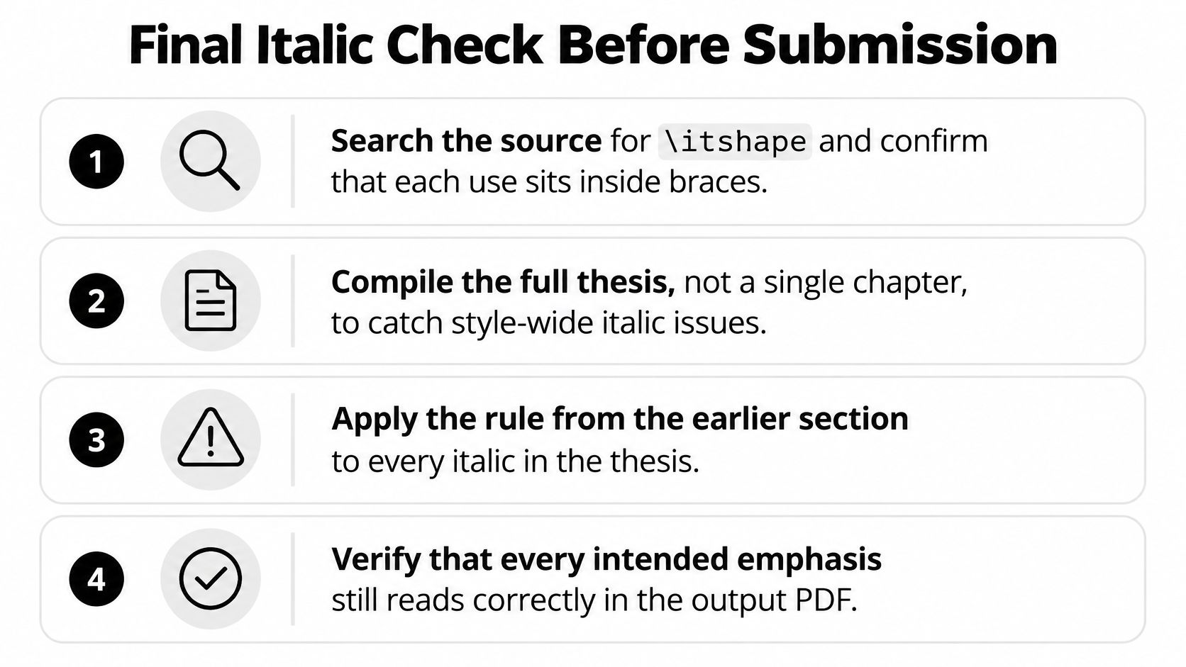
- Search declarations: Find every
\itshapeand confirm it sits inside braces, or inside an environment that ends before the next paragraph. - Compile the whole thesis: A single chapter hides class-level styling. The complete PDF is where captions, theorems, and headings show the shape the class chose.
- Match the style guide: Check every title, species name, and foreign word against the rules your department uses. A practical set of academic writing guidelines is a useful cross-check before you treat every italic as emphasis.
- Test contrast in styled regions: In headings and captions the template may already be italic. Confirm
\emphthere still reads against the surrounding type. - Log forced italics: Keep a short note of each
\textita template required, so a later class change doesn't leave those overrides unexplained. - Repeat after each chapter: Spacing and boundary problems stay small if you catch them while the chapter is still open.
Open the PDF at each italic boundary next to a comma, a period, or an equation. If a gap looks unexpected, fix the command. Don't pad the line with a manual space.
Thesis Book Project gives you a roadmap from proposal to submission, with chapter tracking and milestone reminders so formatting passes like this one don't pile up in the final week. Pair that plan with a source manager while you lock italic titles, species names, and emphasis in each chapter. Visit Thesis Book Project and set the submission date before the next compile.
Related Articles
APA Format for a Website with No Author: How to Cite It
You've found a useful statistic, your paragraph's ready, and now you're staring at a ref...
Academic SkillsAPA Chapter in an Edited Book: Templates and Examples
Chapter author, A. A. (Year). Chapter title in sentence case. In E. E. Editor (Ed.), Book title in i...
Academic SkillsHow to Create Reference List Without Citation Errors
You're close to submission, but your reference list still looks like a collection of database ex...
Comments (0)
No comments yet. Be the first to share your thoughts.